
A
histogram is the most commonly used graph to show frequency distributions. It
is a graphical representation to study distribution pattern of data. A
histogram consists of tabular frequencies arranged adjacent in rectangles
erected over discrete intervals with an area equal to the frequency of the
observations in the interval. The total area of the histogram is equal to the
numbers of data. This helpful data collection and analysis tool is
considered one of the 7 basic quality tools.
WHEN TO USE A HISTOGRAM
Use a
histogram when:
· There
are large number of observations on a single measurable quality
characteristics.
· To
study distribution pattern of the output process.
· To
analyzing whether a process can meet the customer’s requirements.
· To
analyzing what the output from a supplier’s process looks like.
· For
any deviation in process from one time period to another.
· Comparing
two or more processes for any variations.
· For
effective easy and quick communication by graphical presentation.
HOW TO CREATE A HISTOGRAM
1. Collect
50-100 consecutive data points from a process you intended to control.
In a
hospital process control values were identified as a CTQ (Critical to Quality)
parameter. 50 readings were collected which covered all shifts over a week.
They are as follows-
1. Collect 50-100 consecutive data points from a process you intended to control.
9.6
|
9.5
|
9.8
|
10.2
|
10.0
|
9.4
|
9.9
|
9.7
|
9.6
|
10.3
|
9.8
|
9.5
|
9.8
|
9.9
|
10.3
|
9.6
|
9.4
|
9.7
|
9.4
|
9.6
|
9.4
|
10.1
|
9.9
|
10.2
|
9.7
|
9.8
|
9.8
|
9.2
|
9.2
|
9.4
|
9.8
|
9.6
|
9.7
|
9.9
|
9.7
|
10.0
|
9.6
|
9.3
|
10.6
|
9.7
|
9.9
|
9.8
|
9.6
|
10.1
|
9.9
|
9.8
|
10.4
|
10.9
|
10.2
|
2. Calculate
Mean= Select the cell where you want value to appear for you. Then follow


After a
click on “OK” I got Mean= 9.786
3. Calculate
Max and Min Value
Select
the cell where you want the result to appear. Follow-


The Max
Value I got is = 10.9
Similarly
follow the steps for Minimum Value.

4. Calculate
Interval - Depending on the data range select classes of equal width.

5. Calculate
Stand. Deviation
Select
the cell where you want the value to appear. Then Follow-

So the SD
= 0.358
6. Let’s now work out for class width.

You will
note that the following cell is increased by the set interval value. Ensure
that your class value includes Max. and Min. Value as calculated.
7. Now
the next step to know is the frequency of value i.e number of times a value has
occurred in the process. Follow these steps- first place cursor on the
applicable cell. Type “=” select “Formulas” got to “More functions” out of
which select “Statistical” from drop down list select “Frequency”.

You will
be directed to window as shown below-
Note:
In Data_array- click and select your data (here it is QC Value)
enter
and
In Bins_array- click and select calculated class (here
it is QC values- Class) enter
Click “OK”


8. For
other results in frequency column use this short-cut- select the
frequency column (including the formula cell). Go to formula bar, place your
cursor at the end of the formula, press “Ctrl+ Shift+ Enter”. You will get the
frequency of all QC values like shown below-

9. We
are done with our calculation part. Now we will be heading to convert data in
Histogram. For this, Select the Frequency column values, go to “Insert” select
“Bar Chart” go to “Stacked Column”.

10. We
need to do some settings for the chart since it is a Bar graph and not a
histogram chart. So let’s do it!
a. Remove grid
line- select on any grid line and press delete
b. On my X-axis I need range of
QC Values. For this select on chart area, right click then select data. It will
direct you to further window where there is option to edit on right side, click
on edit button and select QC value Class.

It will
look like this-

c. To remove gaps- Right
Click on any bar go to “Format Data Series”

Select
boarder line to black. Chart will look like histogram-

d. To
complete the chart label the chart with title, X-axis and Y-axis etc.

CONCLUSION –
Normal Distribution
The
pattern is unimodal and is fairly centered.
If we know the specifications example in this case let
suppose is 9.8±0.5, the upper limit is 10.30 and lower limit is 9.30.
therefore, though the pattern is fairly centered BUT the
process spread is much wider than the tolerance. This indicated the process is
not capable of meeting the specifications within the tolerance limits,
2.0% fall below lower specification limits and 10.0% has gone beyond the Upper
Specification limits. It needs improvement efforts to get process within the
tolerance limits.
let's discuss histogram shapes!
TYPICAL HISTOGRAM SHAPES AND WHAT THEY
MEAN-
Normal Distribution
A common
pattern is the bell–shaped curve known as the "normal distribution."
In a normal or "typical" distribution, points are as likely to occur
on one side of the average as on the other.

Skewed Distribution
The
skewed distribution is asymmetrical. The distribution’s peak is off center
toward the limit and a tail stretches away from it. These distributions are
called right- or left-skewed according to the direction of the tail.
Double-Peaked or Bimodal
The
bimodal distribution looks like the back of a two-humped camel. The outcomes of
two processes with different distributions are combined in one set of data. 
Plateau or Multimodal Distribution
The
plateau might be called a “multimodal distribution.” Several processes with
normal distributions are combined. Because there are many peaks close together,
the top of the distribution resembles a plateau.
Edge Peak Distribution
The edge
peak distribution looks like the normal distribution except that it has a large
peak at one tail. Usually this is caused by faulty construction of the
histogram, with data lumped together into a group labeled “greater than.”
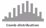
Comb Distribution
In a comb distribution, the bars are alternately tall and short. This distribution often results from rounded-off data and/or an incorrectly constructed histogram.
In a comb distribution, the bars are alternately tall and short. This distribution often results from rounded-off data and/or an incorrectly constructed histogram.
Truncated or Heart-Cut Distribution
The
truncated distribution looks like a normal distribution with the tails cut off.
The supplier might be producing a normal distribution of material and then
relying on inspection to separate what is within specification limits from what
is out of spec. The resulting shipments to the customer from inside the
specifications are the heart cut.
Dog Food Distribution
The dog
food distribution is missing something–results near the average. If a customer
receives this kind of distribution, someone else is receiving a heart cut, and
the customer is left with the “dog food,” the odds and ends left over after the
master’s meal. Even though what the customer receives is within specifications,
the product falls into two clusters: one near the upper specification limit and
one near the lower specification limit. This variation often causes problems in
the customer’s process.
Hope the
article was useful for you. Keep sending your suggestions and comments. Enjoy
reading!
SAP Secrity online training
ReplyDeleteoracle sql plsql online training
go langaunage online training
azure online training
java online training
salesforce online training